When you think of iconic ad moments, what pops into your head? It probably doesn’t take long to get to “Where’s the beef?” or “I’m lovin’ it” because good ads stick with you forever. In fact, Forbes reports that jingles are so effective, they’re making a recent comeback. But where do you get started for your business? It’s important to learn from impactful advertising and see how you might take those lessons to your own efforts. Here are 20 restaurant advertisement examples to inspire your future campaigns.
20 restaurant advertisement examples
1. Chipotle
One of the best restaurant advertisement examples, and probably one of the best ads, period, is Chipotle’s “Back to Start.” It features an animation about sustainable farming that markets the fresh ingredients in their burritos.
Why It’s Great: This is an ad that sticks with you. It’s not because of its catchy jingle, although the music by Willie Nelson is memorable. It sticks with you because it’s storytelling at its best. Good ads always tell good stories.
2. Legal Sea Foods
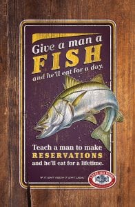
A good ad can take something old and make it new again. Take this example from Legal Sea Foods. It looks vintage and repurposes an old adage we’ve heard many times.
Why It’s Great: Not only is this a sharply designed ad, but it also makes us chuckle. And while the ad is shabby chic, it’s the punchline that counts. The crude marketing message (“make reservations”) gains the depth of a classic adage, reminding us Legal is for those special occasions in our lives.
3. Panda Express
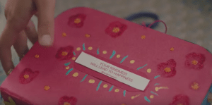
Panda Express launched an ad about a little girl spreading joy through her school and community by passing out fortune cookies. It ends with a tagline: “Where good fortune smiles.”
Why It’s Great: The 2-minute video tugs at the heartstrings. Food and family will always go together, and this ad shows why.
4. Burger King
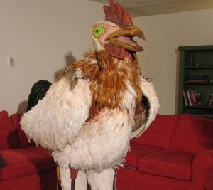
The Subservient Chicken was, well…weird. He made his first appearance in 2004, and then returned in 2014. But people still talk about this as one of the best restaurant advertisement examples of all time.
Why It’s Great: Less established chains might not be to pull this off. But Subservient Chicken was just funny and odd enough to go viral.
5. Denny’s
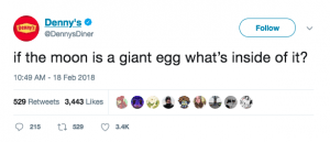
Speaking of weird restaurant advertisement examples, enter Denny’s Twitter account. Of course, social media is a different ball game when it comes to ads. But Denny’s provides off-kilter, funny tweets like this one. Sometimes they make sense. Sometimes they don’t.
Why It’s Great: Denny’s found a specific voice and niche on social media. And that’s hard to do. They know they need a younger crowd to discover the brand to stay relevant. Every tweet is shareable and keeps the brand top of mind as you scroll through your feed.
6. KFC
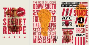
It’s no secret that KFC has tried to rebrand itself. These ads show that they’re not the old-fashioned brand you once knew.
Why It’s Great: These KFC ads offer a fresh, clean design. And they put their product — chicken — front and center. With a design like this, they appeal to a younger audience.
7. Taco Bell
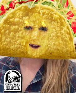
Just as Snapchat filters were all the rage, Taco Bell released the taco-mask filter — and just in time for Cinco de Mayo. According to AdWeek, it was viewed 224 million times, a new record for the app.
Why It’s Great: Restaurant ads like this are stealth. Anyone on Snapchat can send a picture or a video of their face as a taco to everyone in their network. It seems more like a meme than an ad. And yet, the Taco Bell branding was front and center for each of those 224 million viewers to see.
8. Hapa Sushi
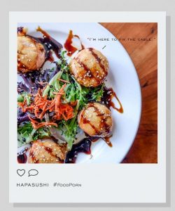
Boulder’s Hapa Sushi is known for its provocative ads. And their #foodporn series is no exception. They showed off gorgeous photos of their dishes, each with a suggestive tagline.
Why It’s Great: These ads take advantage of an Instagram hashtag that is familiar to us. And while the humor grabs your attention, it’s the beautiful photo of the food that really makes you want to drop everything and come to Hapa.
9. Bojangles
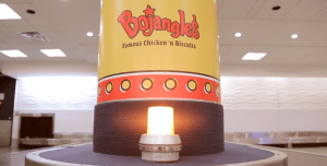
As a part of their “Random Acts of Bo” campaign, Bojangles released a video of a mundane afternoon at an airport baggage claim. Except it wasn’t a normal day, because suddenly Bojangles meals appeared on the carousel for anyone standing nearby.
Why It’s Great: Everyone knows waiting at baggage claim is miserable. But Bojangles flipped the switch on to surprise and delight. But more importantly, they showed families and friends coming together to enjoy their meals.
10. Ruby Tuesday
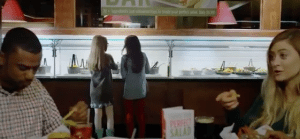
What’s every mom’s worst nightmare? It’s that her kids are having a rough time. Ruby Tuesday’s “Shy Girl” commercial tells the story of a shy girl who just moved to a new school and doesn’t know anyone. Every time the family eats at Ruby Tuesday, she orders the same mac and cheese, until the day she finally makes a friend — while picking out food at Ruby Tuesday’s new, fully stocked garden bar.
Why It’s Great: The ad tells a story, first and foremost. But it’s also clearly targeted at moms, who will melt when they see this little girl’s transformation. For Ruby Tuesday, it shows off the garden bar in a fun way that’s not directly promotional, but still gets the point across.
11. Panera Bread
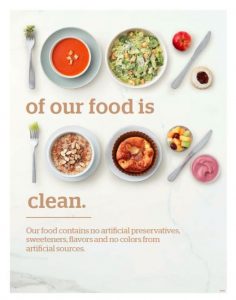
This ad demonstrates in a clean and simple way that Panera Bread serves food with no added preservatives, flavors, or sweeteners. There aren’t a lot of bells and whistles. It gets right to the point.
Why It’s Great: Everyone wants to eat healthier. But casual fast service restaurants don’t always have the best reputation in that regard. But this restaurant advertising example shows that Panera Bread has the edge. And it does so by showing off the variety of their menu.
12. Applebee’s
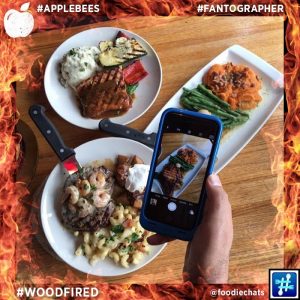
Applebee’s was looking for a lift in their social efforts. They found it with their Fantographer campaign on Instagram. They encouraged diners to take photos of their food or themselves and post to Instagram with #fantographer.
Why It’s Great: User-generated content is, well, free. And it gave Applebee’s a chance to show off how real people interact with their restaurant and their food, adding a sense of authenticity to the brand.
13. Carl’s Jr.
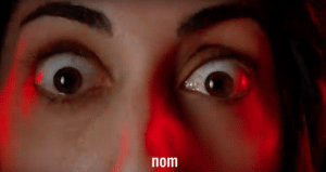
Of course, you remember the Carl’s Jr. campaign with supermodels eating their burgers seductively. The chain’s latest campaign, with videos like “Nom nom nom,” features a voiceover by Matthew McConaughey and complete irreverence.
Why It’s Great: Do the ads make sense? No, they do not. Does it matter? No, it does not. The ads are quirky, but memorable. They show off what Carl’s Jr. does best — burgers. And it does help to have a recognizable voice narrating the whole thing.
14. Moe’s Southwest Grill
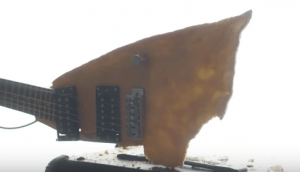
If you didn’t know that Moe’s Southwest Grill is a rock ‘n’ roll brand, you will after watching “Chip Guitars Rock!”. The ad shows a rocker creating the perfect guitar out of the perfect chip.
Why It’s Great: The commercial tells a funny story. A chip guitar might be an absurd notion. But you won’t soon forget that Moe’s is the place to find those chips.

15. Dom Francisco
Dom Francisco is a Brazilian restaurant that wanted to get across that they’re a Valentine’s Day destination. They did so with this funny print ad showing a fork and spoon in bed.
Why It’s Great: The ad is suggestive without being overly sexual. But it’s also a funny image. It gets the message across loud and clear. You bet you’ll be making your Valentine’s Day reservation at Dom Francisco.
16. Wendy’s
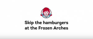
In the Wendy’s 2018 Super Bowl ad, they went right for the jugular by calling McDonald’s out. Ever since the “Where’s the Beef?” days, Wendy’s claim to fame is that they don’t use frozen burgers. They send that message home in this new commercial.
Why It’s Great: This restaurant advertisement is incredibly bold. You don’t often see restaurants go after a competitor with so much fervor. It’s not a tactic that can work for everyone. And it may not work for Wendy’s. But whether you love or hate the approach, it did get everyone talking. And isn’t that the point of ads?
17. Pizza Hut
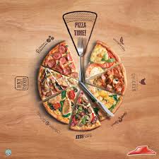
Pizza Hut asks the question: “Which flavor best describes your day?” Luckily, and made clear in this restaurant advertising example, they offer a different slice for every answer.
Why It’s Great: Pizza is everywhere, of course. And for Pizza Hut to stand out, they have to show you why. Did you know they had so many different varieties? Well, you do now.
18. Runza
It takes a minute to get what Runza is going for in this restaurant advertising example. But using three onion rings, the regional Nebraska chain gets to show off their food and their partnership with the circus.
Why It’s Great: The circus theme gave the ad a hook. Runza has great onion rings. But they’re also a proud sponsor of the local circus. It’s the proverbial two birds, one stone.
19. Nando’s
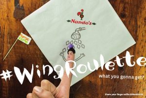
With some clever marketing, Nando’s is now one of the most popular restaurant chains on social media. Their finger selfies campaign, where people draw faces on their fingers, surrounded by a scene drawn on a Nando’s napkin is inspired.
Why It’s Great: This is another restaurant advertising example of user generated content. Nando’s is creating engagement on their social media channels with a fun idea that anyone can do and share any time they are eating Nando’s food. And they benefit from the napkin branding in the background.
20. Nu-Way Weiners
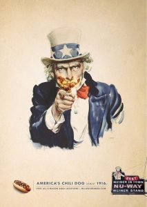
Nu-Way Weiners is a Georgia-based chain and they want you to know that they have great chili dogs.
Why It’s Great: This ad succeeds in a couple different ways. First, it takes a recognizable image and gives it a funny slant. Everyone knows Uncle Sam, and now we know what it would look like if he ate a sloppy (and delicious) chili dog. Second, in the text at the bottom, Nu-Way drives home that they have been in business since 1916, which is no easy feat. They’ve become an American institution, almost as old as Uncle Sam himself.
Are you looking for more restaurant marketing ideas?


