Restaurant Website? Or White Knight? The Best 10 Restaurant Websites That Land Mobile Orders
- Sarah Gurr
- •
- 4 Min Read
- •
You spend your time perfecting your restaurant’s food and presentation, but don’t let your website become an afterthought. Given the rise of digital ordering, a website is vital. A perfect website tells the world who you are, promoting your menu, brand, events, and online orders. According to Fortune, online orders are on the rise. More people are booking their meals online than making a call over the phone. These are reasons to create a website that’s all about your brand, so people can buy your food on the quick. Here are ten of the best restaurant websites. Each is innovative, clever, and beautiful in its own way. This list will inspire you as you design—or redesign—your website.
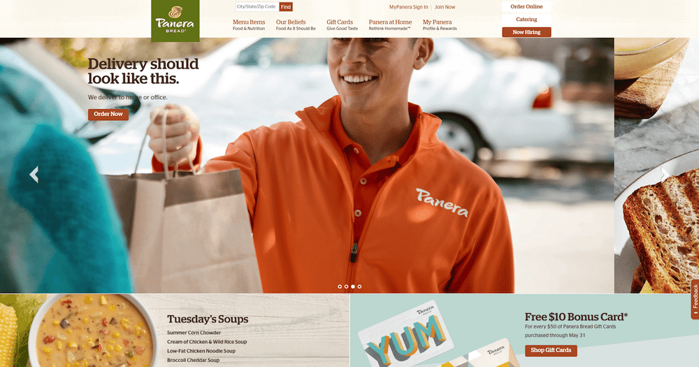
1. Panera Bread: You know the Panera Bread slogan: food as it should be. And the company’s home page shows you just that. The food looks amazing and the “live” menu updates daily soups, and so forth, throughout the day. Ordering online could not be simpler—the website has three “ordering” buttons on the home page alone and plenty of checkout pages to make ordering quick and easy. The website is clean, on brand, and makes you want to order immediately.
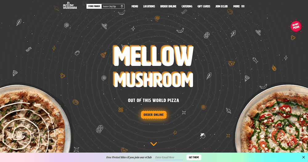
2. Mellow Mushroom: Mellow Mushroom is cool. Its space is cool. Its food is cool. Its website is also cool. The pizza chain promises “out of this world pizza,” but you could say the same about its web experience. Its images are fun, clever, and inviting. Ordering is made easy. Plus, we dare you to click the “do not push” button on the home page (killer design!). You won’t regret it.
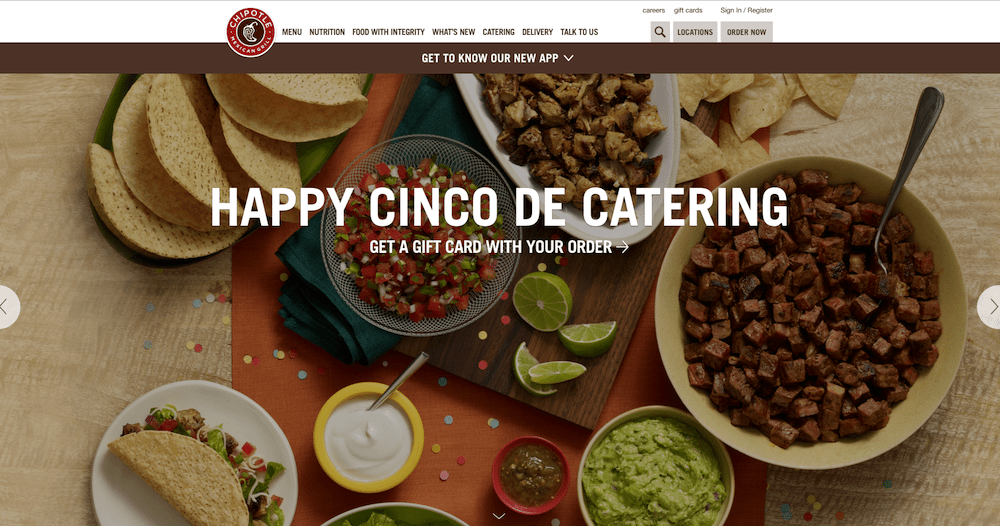
3. Chipotle Mexican Grill: Chipotle is all about fresh ingredients and customizable burritos. That story comes through on every page of its website, with gorgeous photos and videos illustrating the Chipotle experience. There are even step-by-step instructions on how to order food online using a desktop computer or the Chipotle app.
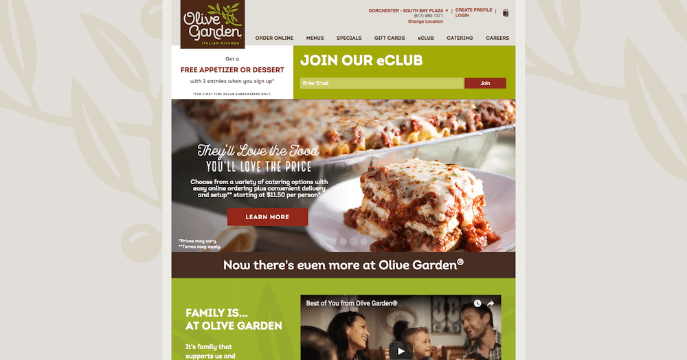
4. Olive Garden: What do you want out of an Olive Garden meal? A great Italian meal with your family, without spending an arm and a leg. That message comes across loud and clear on the chain’s home page. Visitors are treated to beautiful images of food and an offer of a free appetizer or dessert upon joining the company’s email list. The navigation bar makes it easy to order food online, to bring the breadsticks home.
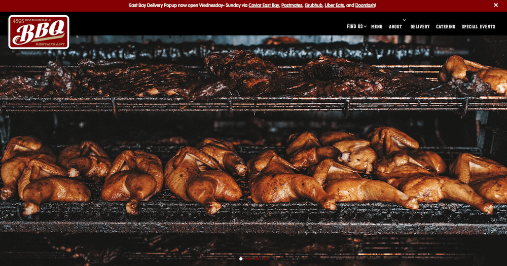
5. 4505 Burgers & BBQ: Sometimes you just need meat, and you need it fast. Thank goodness for the Bay Area chain 4505 Burgers & BBQ. Its website cuts right to the chase. Arguably one of the best restaurant websites out there, the company shows off gorgeous, Instagram-worthy photos of its dishes. And it has multiple “buy” buttons to streamline the ordering process. The website does what it should do. It tells you exactly what the 4505 Burgers & BBQ brand is.
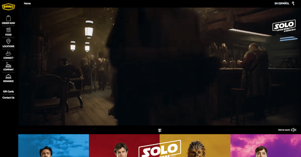
6. Denny’s: Is Denny’s trying to change its image? When you land on the home page, you’re greeted by videos showing off fancy pancakes, fresh ingredients, and a call-to-action (order now) and frictionless checkout. The sleek website features an innovative design you might not expect from the diner.
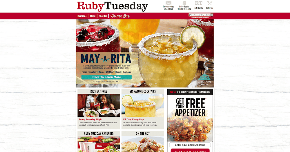
7. Ruby Tuesday: The Ruby Tuesday website is simple. Sometimes simplicity is all you need to create one of the best restaurant websites. It features high-quality photography of the company’s best dishes. It shows off some of its family friendly deals. The site makes you feel right at home, which is how you feel when dining at the restaurant.
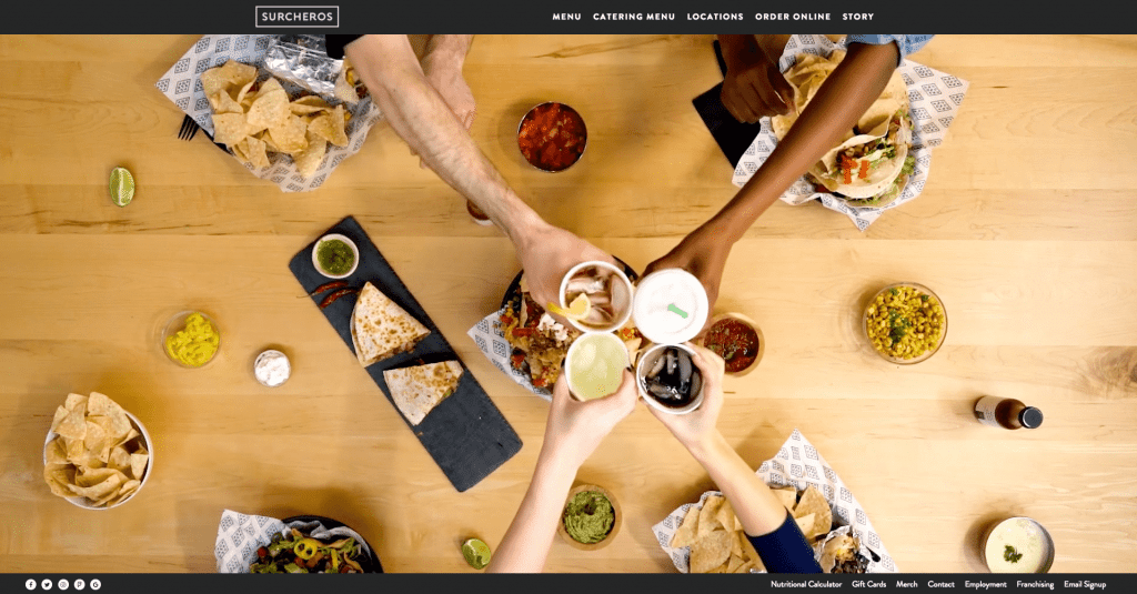
8. Surcheros: The best thing about Mexican food is ordering a bunch of different dishes and sharing with friends. The first thing you see on the Surchero’s website is a video, shot from a bird’s-eye view, of people enjoying a meal together. They’ve got chips and guac and drinks. Most importantly, the image markets the message that Surcheros’s food brings people together. The video takes you straight to a web navigation that guides you to the menu, store locations, and ordering information, making this one of the best restaurant websites on our list.
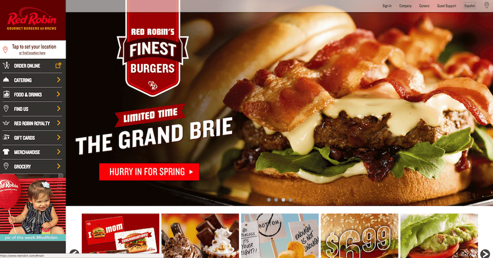
9. Red Robin: What do you think of when you hear “Red Robin“? A vision of burgers and shakes probably dances in your head. That’s why when you enter the Red Robin website, the first thing you see is burgers. And when your eyes glide over to the functional navigation bar on the left, the first thing you see is a button nudging you to “order online.” Red Robin knows exactly how to optimize the user experience.
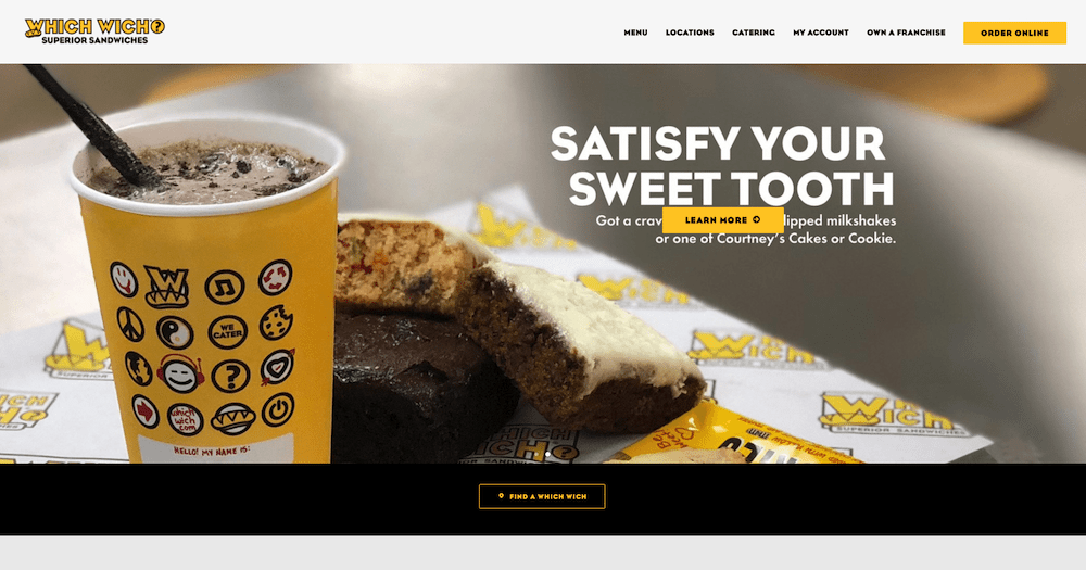
10. Which Wich: As soon as you land on the Which Wich site, it’s clear why this is one the best restaurant websites around. It has a bold design with bright colors and high-quality photos of what really matters—the sandwiches. The top navigation bar is clear, and it’s easy to find exactly what you want right away, the food.
Looking to capture more online catering orders?


